
About
In this project, we were asked to design a website dedicated to selling camping and outdoor products.
We received a brief detailing the objectives and background of the fictitious company ‘EAGLE,’ specializing in camping and outdoor products. Our task was to delve into the design aspects of both the website’s structural framework and its overall conceptual design.
We conducted an in-depth analysis of prominent e-commerce platforms, including Shopify, Amazon, Booking and eBay among others. During this process, we identified both commonalities and distinctions among these platforms.
Based on our comprehensive research, we were tasked with creating a unique company logo.
This logo needed to not only reflect the brand’s identity but also align with the forthcoming website’s design concept.
The Designed Logo
About the Logo
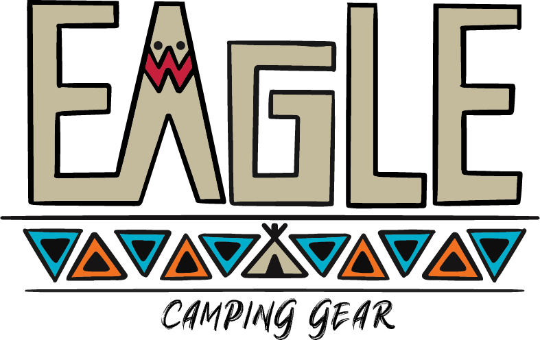
After thorough reflection and a strong desire to create a logo imbued with a unique design and a profound conceptual theme. The resulting company logo features the name ‘EAGLE’ in an Native American culture style.
I chose this cultural style since it resonates with the deep connection that both Native Americans and outdoor enthusiasts share with nature. This choice served as the foundation for my design philosophy, which aimed to not only manifest in the logo but also extend seamlessly to the website.
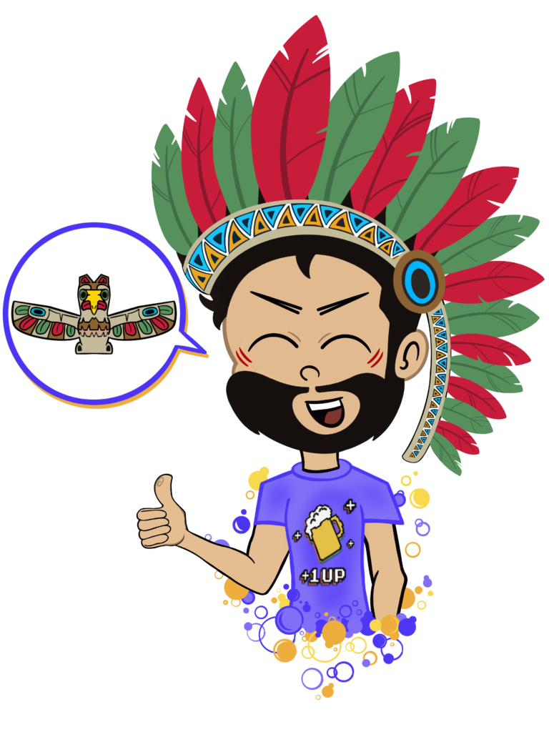
As an example: I introduced an eagle-themed Native American totem as a presenter character, who provides intriguing offers and deals, throughout the website.
Color Palette & Icons
Landing Page (PC)
Hover to Scroll
About the Landing Page
Step into a world of curated shopping experiences on my designed landing page.
Here’s an in-depth look at what’s in store:
Toolbar: Positioned at the top of the page, the toolbar offers access to essential features.
The magnifying glass icon designed as a dream catcher, invites the user to search for desired items.
The Native American head button, opens the user’s personalized profile page.
The heart button lets the users rediscover the items they marked as favorites.
And, before proceeding to the final checkout, the shopping cart icon lets the user review and
manage their selections.
Top Brands Showcase: Directly below the toolbar, a captivating banner image proudly displays the top brands featured on the site.
Explore Diverse Categories: Effortlessly glide between various product categories using intuitive right and left arrows.
Discover New Arrivals: The second section of the landing page displays the latest additions to the inventory.
Top-Rated Selections: The third part of the page introduces a collection of products highly regarded by the community of discerning shoppers.
Customers’ Ratings and Responses: Gain valuable insights into products with ratings and responses from fellow shoppers. Make informed decisions with the help of their feedback.
Join The Community: At the bottom of the page, you have the opportunity to register and become a part of the growing community. Fill in your details and hit “Send” to embark on your shopping journey. On the opposite side, a friendly totem figure extends a warm welcome, offering exclusive promotions to new registrants. Click on the totem’s speech bubble to access the registration screen and receive a special discount for joining.
Product Page (PC)
Hover to Scroll

About the Product Page
Here is my designed product page, where you’ll find all the information you need about the featured product:
Toolbar: The product page features a familiar toolbar, similar to the landing page, providing easy access to key functions. Additionally, quick option buttons have been added to help you navigate different areas of the site efficiently.
Product Display: At the heart of the page is a clear image of the product, allowing the user to appreciate its details fully. On the left side, a gallery of additional images provides different angles and perspectives.
Product Details: On the right side, users will find essential product information.
Product Description: Below the main product details, the users will find an in-depth description of the product, providing comprehensive information to assist them in their purchase decision.
Shipping Information: Learn about shipping options for the product, including delivery times and any associated costs.
Return Policy: Understand the conditions for returning the product, ensuring users have complete peace of mind with their purchase.
Recommended Accessories: Further down the page, users will discover a selection of additional equipment and accessories that complement the featured product. These items are suggested to enhance their overall experience.
Landing Page (Mobile)
Hover to Scroll
About the Landing Page
Just like the desktop landing page, the mobile version also features a toolbar. The scrolling area includes a hamburger button positioned on the left. On the right side of the toolbar, you’ll find two icons – a magnifying glass for searching and a shopping cart button.
The brand strip, situated below the main banner, is also adjusted to fit the screen in the mobile version.
In my design concept, I envision an animation effect where the brand bar smoothly moves from right to left. This animation, while not yet implemented, will allow all the brands displayed on the computer screen to become visible on the mobile phone. The “cut” appearance on mobile is due to this adaptation and the planned animation will make this adjustment more intuitive for users.
While the categories that appeared on the desktop landing screen are retained on mobile, adjustments have been made to ensure they display optimally on smaller screens. Each category now showcases a central image of a single visible product, with two different products partially visible on either side, hinting at the option to swipe right or left for more discoveries. Additionally, beneath each category, there are indicator dots, signifying the ability to slide the screen in either direction.
The remaining sections of the landing page have also been fine-tuned to ensure an ideal presentation on mobile screens accordingly.

About
In this project, we were asked to design a website dedicated to selling camping and outdoor products.
We received a brief detailing the objectives and background of the fictitious company ‘EAGLE,’ specializing in camping and outdoor products. Our task was to delve into the design aspects of both the website’s structural framework and its overall conceptual design.
We conducted an in-depth analysis of prominent e-commerce platforms, including Shopify, Amazon, Booking and eBay among others. During this process, we identified both commonalities and distinctions among these platforms.
Based on our comprehensive research, we were tasked with creating a unique company logo.
This logo needed to not only reflect the brand’s identity but also align with the forthcoming website’s design concept.
The Designed Logo

About the Logo

After thorough reflection and a strong desire to create a logo imbued with a unique design and a profound conceptual theme. The resulting company logo features the name ‘EAGLE’ in an Native American culture style.
I chose this cultural style since it resonates with the deep connection that both Native Americans and outdoor enthusiasts share with nature. This choice served as the foundation for my design philosophy, which aimed to not only manifest in the logo but also extend seamlessly to the website.
As an example: I introduced an eagle-themed Native American totem as a presenter character, who provides intriguing offers and deals, throughout the website.
Color Palette & Icons
Landing Page (PC)
Tap to Scroll

About the Landing Page
Step into a world of curated shopping experiences on my designed landing page.
Here’s an in-depth look at what’s in store:
Toolbar: Positioned at the top of the page, the toolbar offers access to essential features.
The magnifying glass icon designed as a dream catcher, invites the user to search for desired items.
The Native American head button, opens the user’s personalized profile page.
The heart icon lets the users rediscover the items they marked as favorites.
And, before proceeding to the final checkout, the shopping cart icon lets the user review and
manage their selections.
Top Brands Showcase: Directly below the toolbar, a captivating banner image proudly displays the top brands featured on the site.
Explore Diverse Categories: Effortlessly glide between various product categories using intuitive right and left arrows.
Discover New Arrivals: The second section of the landing page displays the latest additions to the inventory.
Top-Rated Selections: The third part of the page introduces a collection of products highly regarded by the community of discerning shoppers.
Customers’ Ratings and Responses: Gain valuable insights into products with ratings and responses from fellow shoppers. Make informed decisions with the help of their feedback.
Join The Community: At the bottom of the page, you have the opportunity to register and become a part of the growing community. Fill in your details and hit “Send” to embark on your shopping journey. On the opposite side, a friendly totem figure extends a warm welcome, offering exclusive promotions to new registrants. Click on the totem’s speech bubble to access the registration screen and receive a special discount for joining.
Product Page (PC)
Tap to Scroll

About the Product Page
Here is my designed product page, where you’ll find all the information you need about the featured product:
Toolbar: The product page features a familiar toolbar, similar to the landing page, providing easy access to key functions. Additionally, quick option buttons have been added to help you navigate different areas of the site efficiently.
Product Display: At the heart of the page is a clear image of the product, allowing the user to appreciate its details fully. On the left side, a gallery of additional images provides different angles and perspectives.
Product Details: On the right side, users will find essential product information.
Product Description: Below the main product details, the users will find an in-depth description of the product, providing comprehensive information to assist them in their purchase decision.
Shipping Information: Learn about shipping options for the product, including delivery times and any associated costs.
Return Policy: Understand the conditions for returning the product, ensuring users have complete peace of mind with their purchase.
Recommended Accessories: Further down the page, users will discover a selection of additional equipment and accessories that complement the featured product. These items are suggested to enhance their overall experience.
Landing Page (Mobile)
Tap to Scroll

About the Landing Page
Just like the desktop landing page, the mobile version also features a toolbar. The scrolling area includes a hamburger button positioned on the left. On the right side of the toolbar, you’ll find two icons – a magnifying glass for searching and a shopping cart button.
The brand strip, situated below the main banner, is also adjusted to fit the screen in the mobile version.
In my design concept, I envision an animation effect where the brand bar smoothly moves from right to left. This animation, while not yet implemented, will allow all the brands displayed on the computer screen to become visible on the mobile phone. The “cut” appearance on mobile is due to this adaptation and the planned animation will make this adjustment more intuitive for users.
While the categories that appeared on the desktop landing screen are retained on mobile, adjustments have been made to ensure they display optimally on smaller screens. Each category now showcases a central image of a single visible product, with two different products partially visible on either side, hinting at the option to swipe right or left for more discoveries. Additionally, beneath each category, there are indicator dots, signifying the ability to slide the screen in either direction.
The remaining sections of the landing page have also been fine-tuned to ensure an ideal presentation on mobile screens accordingly.