In this project, we were given a task: to create a fresh logo for a subsidiary company using an existing company’s logo as a foundation. The subsidiary focuses on offering a range of delicious drink flavors(or possibly a single exceptional flavor).
Following that, we were entrusted with designing a label for a beverage can that would showcase the subsidiary’s logo and convey its unique brand identity effectively. Our goal was to capture the essence of the brand in an eye-catching and cohesive label design.
Finally, we were challenged to develop packaging concepts for the beverage cans, aiming to deliver an engaging and visually appealing packaging experience. Through meticulous attention to detail, we aimed to simulate the packaging design and present a compelling representation of the final product.
The Sub-branded Logo
About the Logo
Drawing inspiration from the distinct flower-like shape of the Adidas logo, I embarked on a thrilling quest to find a fruit or plant that could be artistically shaped to encompass the essence of this iconic symbol. Eventually, I settled on naming the subsidiary “Adidas Sabres,” specializing exclusively in crafting energy drinks with delectable Sabres flavors. Thus, the logo came to life, representing the fusion of artistic ideas.
Color Palette
Label Design • Package Layout Design
About the Label Design & Package Layout Design
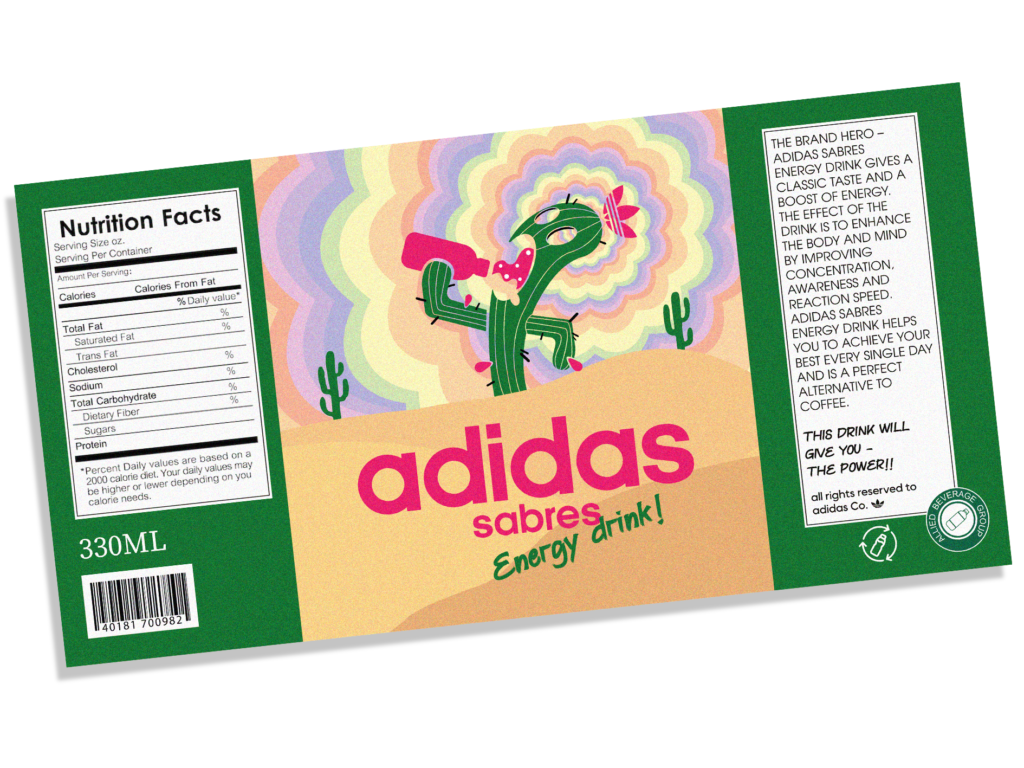
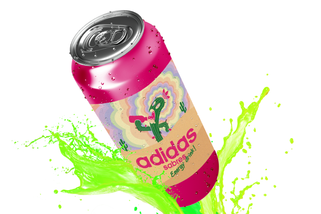
Taking cues from the logo, I meticulously designed a label that harmonizes with the vibrant color schemes commonly found on energy drink cans in the market. My aim was to create a visually captivating label that seamlessly blends with its counterparts while standing out with its own unique allure.
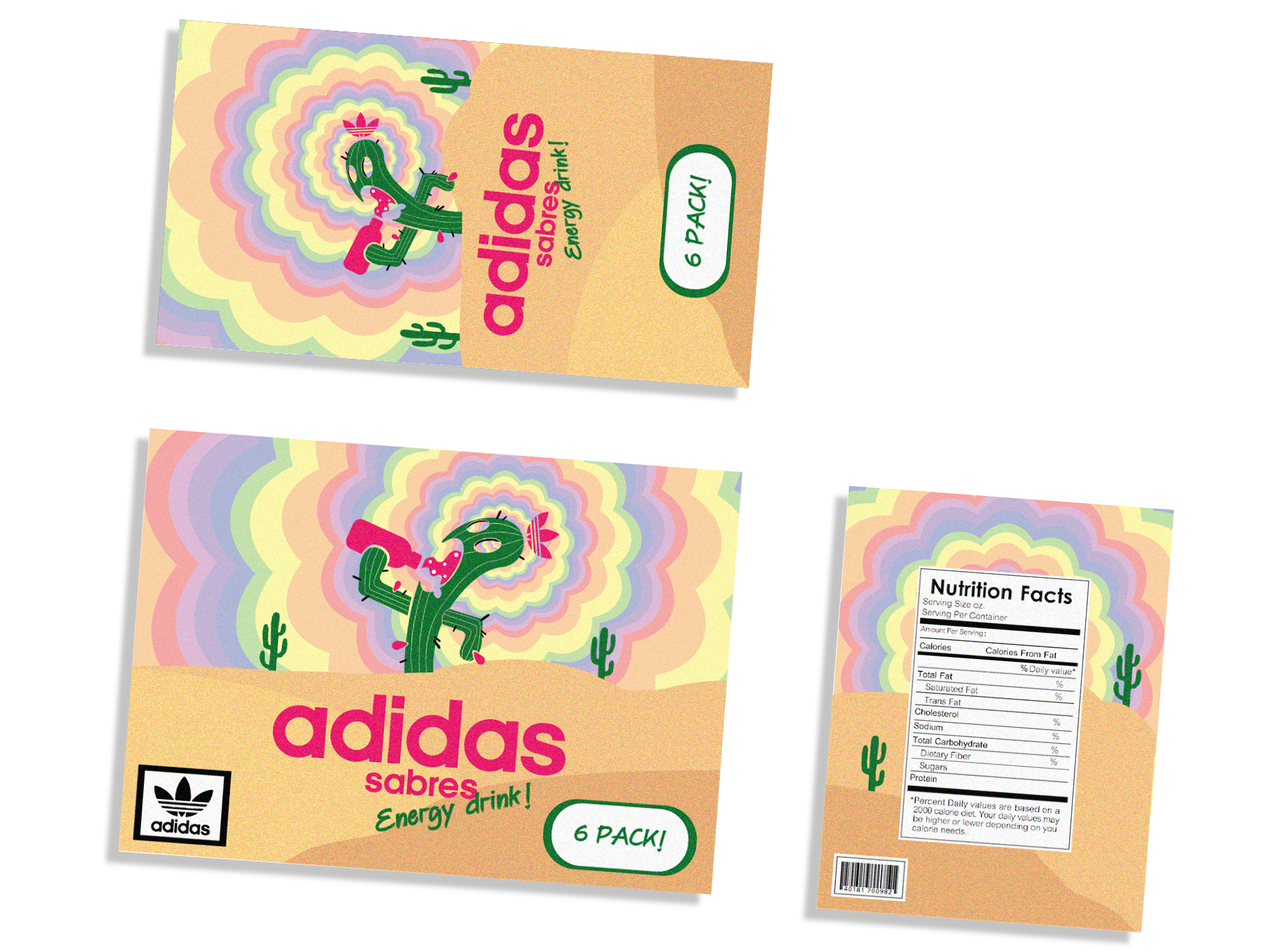
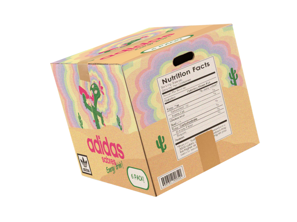
Lastly, leveraging the brand’s distinctive visual identity established by the logo and label, I delved into the realm of can packaging design. Every aspect of the packaging was thoughtfully considered to align with the brand’s core identity, delivering an enchanting and immersive visual experience.
The Final Products
About
In this project, we were given a task: to create a fresh logo for a subsidiary company using an existing company’s logo as a foundation. The subsidiary focuses on offering a range of delicious drink flavors(or possibly a single exceptional flavor).
Following that, we were entrusted with designing a label for a beverage can that would showcase the subsidiary’s logo and convey its unique brand identity effectively. Our goal was to capture the essence of the brand in an eye-catching and cohesive label design.
Finally, we were challenged to develop packaging concepts for the beverage cans, aiming to deliver an engaging and visually appealing packaging experience. Through meticulous attention to detail, we aimed to simulate the packaging design and present a compelling representation of the final product.
The Sub-branded Logo
About the Logo
Drawing inspiration from the distinct flower-like shape of the Adidas logo, I embarked on a thrilling quest to find a fruit or plant that could be artistically shaped to encompass the essence of this iconic symbol. Eventually, I settled on naming the subsidiary “Adidas Sabres,” specializing exclusively in crafting energy drinks with delectable Sabres flavors. Thus, the logo came to life, representing the fusion of artistic ideas.
Color Palette
• Label Design •
• Package Layout Design •
About the Label Design & Package Layout Design
Taking cues from the logo, I meticulously designed a label that harmonizes with the vibrant color schemes commonly found on energy drink cans in the market. My aim was to create a visually captivating label that seamlessly blends with its counterparts while standing out with its own unique allure.
Lastly, leveraging the brand’s distinctive visual identity established by the logo and label, I delved into the realm of can packaging design. Every aspect of the packaging was thoughtfully considered to align with the brand’s core identity, delivering an enchanting and immersive visual experience.