About
In this project, our objective was to undertake a comprehensive rebranding process for an existing business. Our primary focus was to revamp the company’s branding by delving into its core values, which are currently reflected in its logo and the products it offers. Leveraging the power of graphic and design elements, we aim to craft a fresh and captivating new logo for the company, along with related products, all of which will align coherently with the new branding language.
I decided to work on the rebranding of “Potion Bar,” a youthful and vibrant establishment located on 16 Allenby Street in Tel Aviv. This bar caters mainly to young adults, typically aged between 18 and 25.
What sets “Potion Bar” apart is its captivating presentation of cocktails – served in various colors within potion-like glass bottles, set on illuminated stands, creating a mesmerizing glow that resembles phosphorescent potions.
It’s truly an enchanting experience!
The Rebranded Logo

About the Logo
In the pursuit of revitalizing “Potion Bar”, the existing logo served as a starting point for our creative journey. The original design juxtaposed the words “Potion” and “Bar,” with the latter confined within a potion-like bottle while the former floated above.
However, to improve legibility and catch the eye of potential customers, I decided to merge the two words into a cohesive and more easily recognizable name within the logo.
Drawing inspiration from the vibrant ambiance of nightlife, I curated a striking font style reminiscent of a pink neon sign – a tribute to the electric energy that envelops bars during the night.
This choice imbues the logo with a captivating allure, enticing patrons to step into the world of “Potion Bar.”
Taking creativity a step further, the letter “O” in “potion” underwent a captivating transformation.
I crafted a bottle-shaped icon in a mesmerizing green hue, reminiscent of a glowing phosphorescent potion. Delicate wisps of smoke emanate from the bottle, symbolizing the tantalizing cocktails that conjure a magical atmosphere within the bar.
This distinctive element serves as an immediate visual representation of the bar’s enchanting offerings, leaving a lasting impression on all who encounter it.
Color Palette & Icons
#DA4598
#6BBE45
#9060A8
#EC202E
#31BEBF
#FCD10B
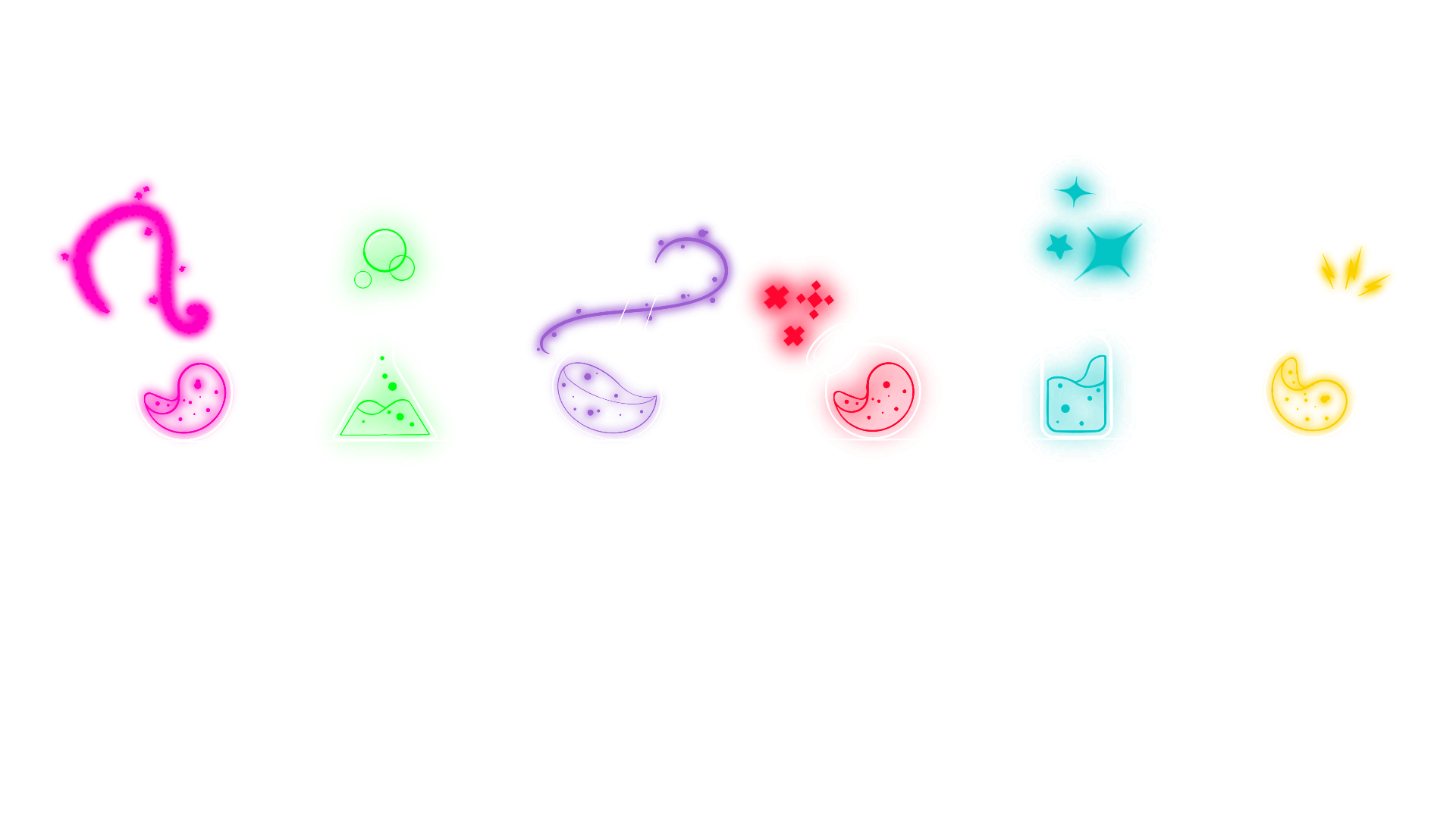
Drawing inspiration from the logo’s design, I’ve crafted a distinctive branding language that captures its essence through colors and shapes, notably mirroring the potion’s form from the logo.
Guided by this inspiration, I curated a series of unique potions. While each potion boasts its own individual color and shape, they all share the logo’s signature style. This duality serves a twofold purpose: showcasing the cocktails’ distinct differences, while also visually reinforcing their inherent connection to one another. This approach underscores their individuality and shared identity simultaneously.
Business Card Design • Envelope Design • Invoice Design
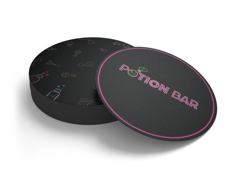
Coaster Design • Menu Design • Advertising Posters Design


About the Menu
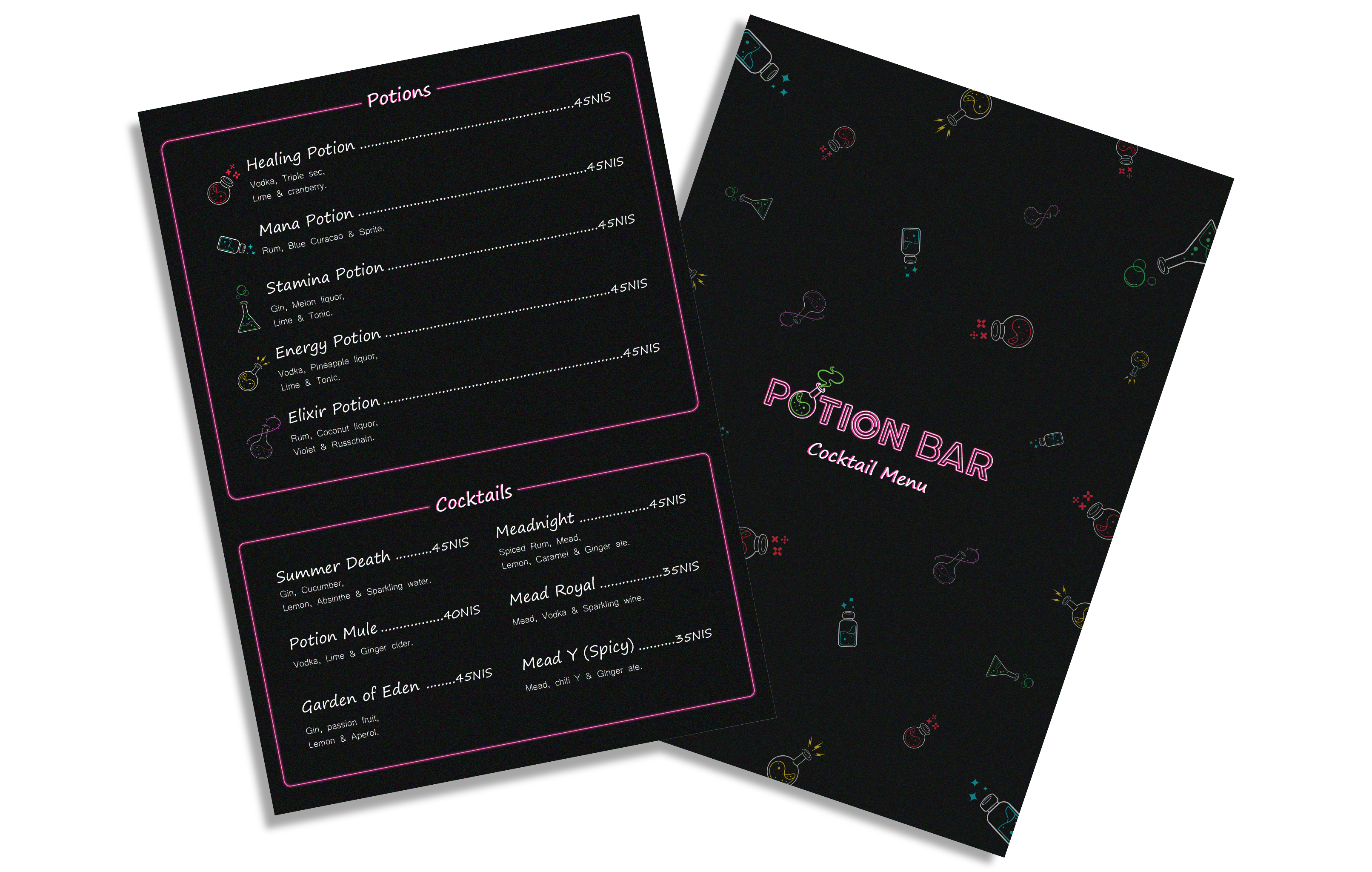
In redesigning the menu, significant changes stand out.
Notably, each cocktail entry now features an eye-catching potion-like icon,
a departure from the current menu.
These icons exclusively accentuate for the potion-served cocktails only, distinguishing them.
The overall menu design is also more streamlined, ensuring easy navigation.
The goal is an elegant menu that highlights cocktail uniqueness while improving user experience.


About the Posters
I’ve crafted a series of three dynamic advertising posters, all following a consistent design theme.
The first poster invites everyone to a captivating Halloween party, where the aroma of cocktails mingles with enchantment.
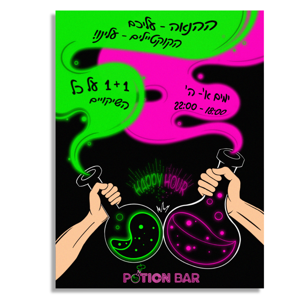
The second poster showcases a classic happy hour, highlighting a 1+1 offer on all cocktails presented in charming potion bottles, underscoring the bar’s distinctiveness.
The third poster is a bit more creative, inspired by the bar’s Facebook page, which revealed their invitation to watch the final episode of season 6 of ‘Rick and Morty’, I infused the iconic faces of these characters inside potion bottles. The familiar logo of the animated series was added to resonate with fans, and draw curious eyes alike.
Each poster has a visual narrative and is related to the event it celebrates.
Fonts

About the Fonts
In my design approach, fonts play a pivotal role in setting distinct tones for various design elements.
For the dynamic ambiance I aimed to create on business cards and cocktail menus,
‘Segoe Print’ emerged as the perfect choice, radiating youthful cheerfulness.
On the other hand, to establish a sense of formality and officiality across office stationery,
‘Microsoft Yi Baiti’ stood out.
Its refined elegance conveys the professionalism required for such documents.
When it came to advertising posters, my font selection danced between languages.
‘Jack Armstrong BB’ for English and ‘gveret Levin’ for Hebrew were my choices,
echoing the playful spirit of ‘Segoe Print.
Skillful font adjustments were combined with vibrant, neon colors to highlight potions and evoke an enchanting, almost magical, atmosphere.
About
In this project, our objective was to undertake a comprehensive rebranding process for an existing business. Our primary focus was to revamp the company’s branding by delving into its core values, which are currently reflected in its logo and the products it offers. Leveraging the power of graphic and design elements, we aim to craft a fresh and captivating new logo for the company, along with related products, all of which will align coherently with the new branding language.
I decided to work on the rebranding of “Potion Bar,” a youthful and vibrant establishment located on 16 Allenby Street in Tel Aviv. This bar caters mainly to young adults, typically aged between 18 and 25.
What sets “Potion Bar” apart is its captivating presentation of cocktails – served in various colors within potion-like glass bottles, set on illuminated stands, creating a mesmerizing glow that resembles phosphorescent potions.
It’s truly an enchanting experience!
The Rebranded Logo

About the Logo
In the pursuit of revitalizing “Potion Bar”,
the existing logo served as a starting point for our creative journey. The original design juxtaposed the words “Potion” and “Bar,” with the latter confined within a potion-like bottle while the former floated above.
However, to improve legibility and catch the eye of potential customers, I decided to merge the two words into a cohesive and more easily recognizable name within the logo.
Drawing inspiration from the vibrant ambiance of nightlife, I curated a striking font style reminiscent of a pink neon sign – a tribute to the electric energy that envelops bars during the night.
This choice imbues the logo with a captivating allure, enticing patrons to step into the world of “Potion Bar.”
Taking creativity a step further, the letter “O” in “potion” underwent a captivating transformation.
I crafted a bottle-shaped icon in a mesmerizing green hue, reminiscent of a glowing phosphorescent potion. Delicate wisps of smoke emanate from the bottle, symbolizing the tantalizing cocktails that conjure a magical atmosphere within the bar.
This distinctive element serves as an immediate visual representation of the bar’s enchanting offerings, leaving a lasting impression on all who encounter it.
Color Palette & Icons
#DA4598
#6BBE45
#DA4598
#6BBE45
#DA4598
#6BBE45
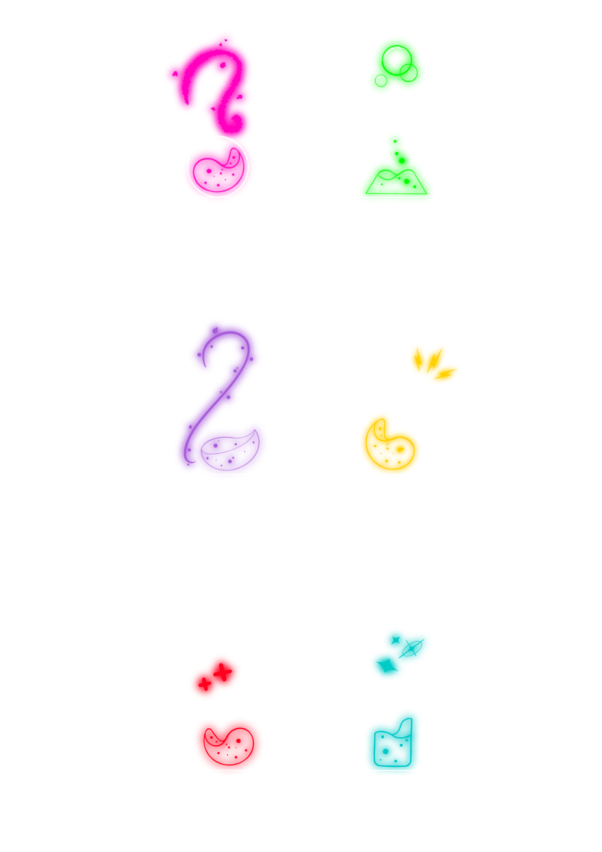

Drawing inspiration from the logo’s design, I’ve crafted a distinctive branding language that captures its essence through colors and shapes, notably mirroring the potion’s form from the logo.
Guided by this inspiration, I curated a series of unique potions. While each potion boasts its own individual color and shape, they all share the logo’s signature style. This duality serves a twofold purpose: showcasing the cocktails’ distinct differences, while also visually reinforcing their inherent connection to one another. This approach underscores their individuality and shared identity simultaneously.
• Business Card Design •
• Envelope Design •
• Invoice Design •
• Coaster Design •
• Menu Design •
• Posters Design •


About the Menu
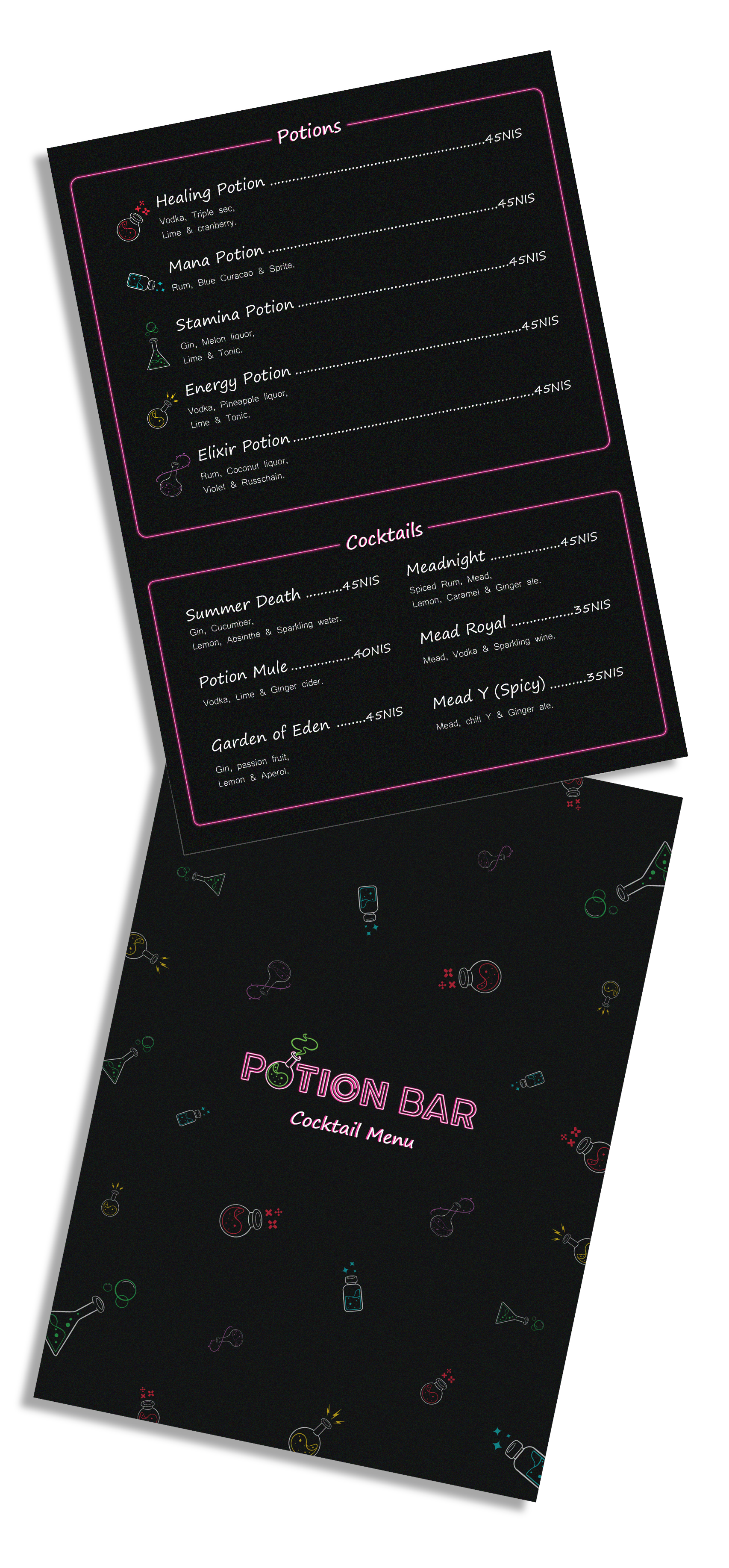
In redesigning the menu, significant changes stand out.
Notably, each cocktail entry now features an eye-catching potion-like icon,
a departure from the current menu.
These icons exclusively accentuate for the potion-served cocktails only, distinguishing them.
The overall menu design is also more streamlined, ensuring easy navigation.
The goal is an elegant menu that highlights cocktail uniqueness while improving user experience.


About the Posters
I’ve crafted a series of three dynamic advertising posters, all following a consistent design theme.
The first poster invites everyone to a captivating Halloween party, where the aroma of cocktails mingles with enchantment.
The second poster showcases a classic happy hour, highlighting a 1+1 offer on all cocktails presented in charming potion bottles, underscoring the bar’s distinctiveness.
The third poster is a bit more creative, inspired by the bar’s Facebook page, which revealed their invitation to watch the final episode of season 6 of ‘Rick and Morty’, I infused the iconic faces of these characters inside potion bottles. The familiar logo of the animated series was added to resonate with fans, and draw curious eyes alike.
Each poster has a visual narrative and is related to the event it celebrates.
Fonts

About the Fonts
In my design approach, fonts play a pivotal role in setting distinct tones for various design elements.
For the dynamic ambiance I aimed to create on business cards and cocktail menus,
‘Segoe Print’ emerged as the perfect choice, radiating youthful cheerfulness.
On the other hand, to establish a sense of formality and officiality across office stationery,
‘Microsoft Yi Baiti’ stood out.
Its refined elegance conveys the professionalism required for such documents.
When it came to advertising posters, my font selection danced between languages.
‘Jack Armstrong BB’ for English and ‘gveret Levin’ for Hebrew were my choices,
echoing the playful spirit of ‘Segoe Print.
Skillful font adjustments were combined with vibrant, neon colors to highlight potions and evoke an enchanting, almost magical, atmosphere.